Hi,
I jump in, to react to the UI art style, I don’t know if there is any plan to improve it for the HD version, but it’s pretty messy in the current state, and considering how far you’ve come, it could use some rework I think.
on this screenshot http://www.fortressofdoors.com/content/images/2015/09/dq1080sprite-1.png
I count :
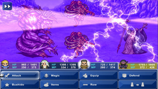
4 different text colors, (white, black, yellow, grey, what an original mix)
6 different backgrounds (including buttons), (2 textured grey, 1 textured brown, 2 grey gradient, 1 gradient blue, yet again, an original mix)
plethora of different text size
It doesn’t feel like there is any art coherency in the UI.
I love your game, (regardless of what I said) keep up the good work.
Aequi

 They even screwed up the script.