Defender's Quest 2 - Weaselmancer and cast preview
This is a companion discussion topic for the original entry at http://www.fortressofdoors.com/defenders-quest-2-weaselmancer-and-archer/
Oh dear. This is shaping up to have even more antagonism than DQ1 did. I’m not sure the fate of this particular world is a good one.
Those animations looks really nice, thing is it looks a bit too “cartoony” - more like for flash game than indie title. But well, im cheering for you guys anyway and still waiting for DQ1HD port 
I think I get where your point is coming from, but actually quite like the designs myself.
What matters most (to me anyway) is that it feels like the characters have a personality, and just looking at Cleverness happily plonking down a trio of weasels from her bag already makes me far more giddy than a “flash game” has in a long time.
So, yeah. Colour me thoroughly excited for DQII!
I like the character designs. It’s got a bit of Final Fantasy Tactics feel. The smaller lineup is probably a good indication of their scale in-game, I’d guess?
Yeah, I can do some mockups contextualizing them in game. At 1080p they’ll definitely be big enough to make out the details.
I’m loving those designs. I’d go with ferrets instead of weasels though…
Question about the DQ2 engine…did you try going the Entity-Component-System route?
The architecture hasn’t been massively changed from the original Defender’s Quest actionscript engine, or else the game would take even longer to develop. It uses some basic inheritance, but the major classes (defenders & enemies for instance) are highly modular and data-driven. So there’s no special hard-coded class for any character class or enemy type, they all just derive from data properties.
Nice! Really love that art! I also like that cartoonish style into it (I mean, DefQ1 wasn’t all THAT realistic either). Really cool animations, weasels are cool.
Oh my. Cleverness is my new favorite. By a lot. That said, the violet cloak and eyes work much better for her than the green. Would help her stand out from the lineup, which is a thing when I look at the lineup.
Your Fighter and Duelist class designations confuse me. I guess I can almost see it, but my instinct says the one with the shortsword and dagger should be the Duelist, the one with the greatsword should be the Fighter, and that’s not really going to change, I think. Greatswords really seem like bad dueling weapons and more ‘I’m cleaving my way through your army’ fighter weapons. Whereas the ‘Duelist’s dagger’ is a thing for a reason.
But speaking of New Guy, excuse me while I sigh. One moment. Okay, back. New Guy is your plucky, almost blank slate, has to prove and define himself youth of a character. And almost nobody ever pulls it off right in video games. They often just stay the same empty character until the end, and a lot of them are kinda whiny and annoying. But I can’t say that yet, so let me just harp on the art. He’s like the Ur example of your art design here - stripped down and basic as it gets, and so he just visually screams ‘I have no character’. This is a problem. If you had hired me as a consultant for some crazy reason, I’d tell you to go back to the drawing board, figure out who you want this character to become as the game’s story progresses, and design in a little visual clue or tell for us. And no, the greatsword doesn’t count.
Lars, you really have a thing for garish knights, don’t you? While I personally wish the Guard Herald had enough self awareness to figure this sort of thing out, it kinda goes down to the royal emblem and colors design types being terrible at their job, and this happens, so… I suppose? I’m not exactly sure what he’s holding in his hand either. I wanted to pretend it was the stock of a gun, but it’s like a bugle trumpet thing, I think?
The Demolisher is great, except I could wish for a bit more distinction for that claw arm of his in that particular static sprite. The problem comes when the Champion had to be even burlier than him and got an oversized torso and gigantor head to compensate. It really seems to break the mold, but eh, that’s personal preference and you can totally get away with it if you want. Sometimes you’re suppose to break the mold. The actual real issue with the Champion is that his gear makes him look like he’s about to play street hokey or something. Both by design and color, it’s kinda flat, a little generic, and so doesn’t really say what I think you mean for it to say.
Mr. Sky Whaler needs another pass. His sprite just isn’t there yet.
For the archer, that really quite spiffy bit of crossbow art clutters his sprite, which mostly comes down to color design between the character and weapon not being distinctly different enough. But I think the biggest problem of the moment is that he’s basically male healer with a crossbow. If they were brother and sister, that’d be one thing, but I feel like we can do better here. Especially if they aren’t siblings. Especially if you want the big visual clue you’re looking at an archer and not the healer to be something other than it’s the one with crossbow looking clutter in the middle.
The Gunner is giving me such FF6 Edgar vibes, and that makes me happy, but it blurs a bit when you shrink the sprite down that much with the back of the turret. You don’t quite get the distinct line between his beard and the turret, which is mostly a color thing. But it’s also a thing that crops up with a lot of the sprites at that small size, that they lose the distinctions that the bigger, animated set has. Also seen with Javir’s neckline, the body armor on the Beast Master and plagues the Hermit in general.
The Hermit, like Cleverness, is another example where the changes in color design on the animated set look like a great improvement. And I rather like the design in general. For the animation, there is a wee bit of an issue with the pinkie on the hand held back, tho’.
Oh, and while the animation set is quite wonderful in general, I’m having http://www.thegamercat.com/comic/bouncer/ issues with it as a whole. I think this is an instance where style overshadows art and causes problems, especially when less bounce could help define some of the characters. They almost managed it with the Demolisher, then you realize his bomb is playing countersynch to everything. >.< The Hermit wins this round.
Well played, Hermit, well played.
oh my gosh weaselmancer IT SOUNDS AMAZING I LOVE IT. JUST THE PERFECT ZANY LITTLE SHIT TO GO RUINING EVERYONE’S LIVES. i want 12 even if i can have only one.
I’ll be honest, ‘New Guy’ does have the most generic appearance by a long shot. He looks like the ‘Generic Swordsman’ you would recruit in Final Fantasy Tactics, or some other TD game. Simple hairstyle, simple outfit, simple weapon. He needs a certain something to make himself distinguishable, I think.
Everyone else is distinct and immediately identifiable. New guy does make me think “Who / What is that?”, but maybe that’s what you’re going for. 
I don’t know what sort of distinguishing feature he could really get, though. Maybe a tattoo unless, again, ‘non-descript’ is what’s intended.
Maybe New Guy changes as the story goes on? I guess we’ll never know until the game comes out. 
I agree with you on the duelist and fighter class designations, they should probably be switched. I like the Sky Whaler as he is though. The design just works for me.
I’m working on a TD game myself using the Haxe port of Richard Lord’s Ash ECS framework. Maybe in future you might want to take a look at the ECS paradigm. Its pretty cool to work with.
Couple a things:
-
The “fighter” designation is a placeholder word. Terevan is a crowd-control Slak replacement, designed for chopping up lots of targets at close range. Basically she’s a berserker but we haven’t decided if we like that word or not.
-
The “duelist” designation is not supposed to bring a rapier-fencer to mind. The greatsword is intentional. This is a guy who focuses on devastating crippling strikes, focusing on one target at a time. He’s more like Markos from the original game, but not exactly the same.
I am not the best person to talk to about this sort of stuff though, you want James for that (our writer). You’re just hearing things here second-hand from me so I wouldn’t make any final judgments just based on what pops out of my mouth.
- “New Guy” definitely has a backstory and a lot more characterization than we’ve so far revealed, the same goes for all the other characters. If something is confusing, rest assured we’ve got more to show later on.
EDIT: To be sure we do appreciate your feedback and always take it under consideration!
I didn’t mean he looks generic in terms of writing, backstory or characterization, I meant his artstyle.
Alongside all his team mates - and especially compared to the DQ cast - he just looks… eh. Maybe his personality, backstory or something else makes up for the ‘Generic Fighter Dude’ appearance. 
Yeah that’s a fair assessment. Well, this is only a first pass, plenty of time to give more attention to these things before release.
I kinda like the ‘generic’ dude. I suspect that as he levels up his appearance will change in accordance with his skill tree. Looking at the other characters there is a ‘level 1’ type feel to all them…like there is room to grow. I mean look at the fighter’s yellow bandanna…its screaming for a skull and bones insignia (hint hint). And you just know that the Demolish-er is going to be fitted with some high-tech eye-piece once he ramps up.
Speaking of skill trees, do you plan on branching skill trees so as to create multiple specializations per class? Would be great for replay-ability.
So the current design we’re thinking about for skill trees is not totally set in stone. Broad strokes:
We found in the original game that our trees kind of tended towards a few optimal builds with some obvious dump skills and, and the fine granularity of allocating skill points across 36 characters became tedious.
Our mantra is that an interesting choice is made up of options that are:
- different
- balanced
- limited
- clear
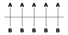
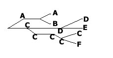
So we’re going to be designing the skill trees much more around “okay at this tier do I want skill A or skill B” without any of that affecting/limiting your other choices later on.
So more like this:

And less like this:

