Kickstarter is the go-to solution for crowdfunding these days, but I'm a control freak so I designed a custom solution for our upcoming game, Defender's Quest II: Mists of Ruin.
No solution is one-size-fits all; we're in the unique situation of developing the sequel to a critically acclaimed title, namely Defender's Quest: Valley of the Forgotten.
The pre-order page for DEFQ2 looks like this:

This is heavily influenced by starbound's preorder page, and it solves several key problems I find with the way Kickstarter displays rewards.
Visual Clarity
First of all, what you see is what you get. All of the rewards are represented by visual icons, and cumulative rewards from previous tiers can be added. For example, our book tier includes a digital art/story book, as well as all previous rewards: the game's soundtrack (from the music tier), and games (from the game tier).
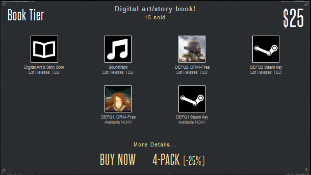
Just by looking at this tier, you know immediately what you're going to get -- everything in the box. And if you want detailed information, you can click on the "more details..." box which will expand and lay things out explicitly:
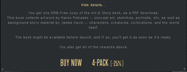
And just to be super-compulsively clear, when you click "buy now," it takes you to a new page with a Humble Store pre-order widget, puts all the details in a box below, and replaces the "all of the above" line with the actual descriptions from cumulative tiers.
Compare this to a typical kickstarter reward tier.
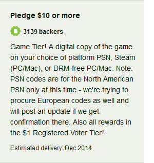 This example is from the awesome upcoming RPG Cosmic Star Heroine, and is a commentary on Kickstarter itself rather than their game or rewards.
The developer has to cram the reward text into a narrow box, and has no formatting options whatsoever. You can't separate important information in a smaller box under "more details," you can't put the "Note" in italics or a smaller font, and you can't even create a proper title for the tier and set it in bold. It all runs together.
Worst of all, relating how cumulative tiers work is confusing at best, which is why the "...and all of the above" convention has become so popular, and thus expected.
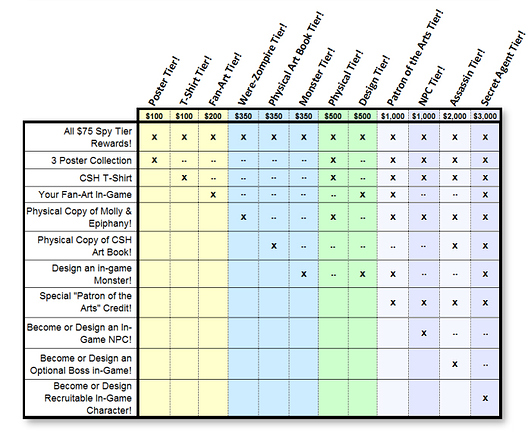
You can't always follow the "all of the above" model (especially for more expensive limited tiers), and developers who break with that format are then reduced to creating charts to explain exactly what each tier provides:
I'd like to reiterate that I'm not knocking Cosmic Star Heroine or Zeboyd Games for this. Not only am I a big fan (I totally baked CSH), but this is pretty much how you have to explain things if you use Kickstarter.
CSH clearly isn't hurting from using Kickstarter -- they made their goal and then some. I just think there are much simpler and clearer ways to present rewards, and Kickstarter's format kinda locks you in a box.
"Comparison is the thief of joy" -- Teddy Roosevelt
Kickstarter campaigns don't exist in a vaccuum, so backers tend to compare campaigns against one another. Given KS's standardized pitch format, this makes it very easy to line up A vs. B, and thus puts a lot of pressure on you to standardize your pitch accordingly, even if that pitch doesn't play to your strengths.
For instance, the "Talking Heads" video format, complete with professional lighting, editing, and sound, has become quite popular and even expected (even if some developers eschew it). If you're launching on Kickstarter, the video takes center stage.
But what if you don't want to make your pitch that way? Videos are important, but I'd rather let my actual pitch do the pitching, and make the video a simple, direct, summary, sans talking heads:
My wife is fond of pointing out "social inflation" -- for instance, weddings started as simple ceremonies but now have expensive dresses and rehearsal dinners, brunches, etc. Kickstarter started as a simple crowdfunding format, but then professional videos, complicated reward schemes, and stretch goal after stretch goal got added to the mix.
There's many sane video game Kickstarters, for sure -- I just want to avoid the inflationary pressure of that environment entirely.
We also aren't interested in doing any physical rewards, given the massive boondoggle that has been for other developers. The whole point of this is to make the game happen sooner, not later, and therefore all rewards are either directly related to game production (such as naming a monster in our special "ending credits" bonus battle after you), or at least by-products of it (such as the digital art&story book).
And don't even get me started on "stretch goals." Suffice it to say, we won't have any.
Fulfillment
Kickstarter can make fulfillment a bit of a chore, since it's not really a content delivery platform.
Humble Store definitely makes fulfillment easy, since they're all about delivering digital content. As soon as something's ready, we just upload the bits to their servers, and the backers get their stuff.
For instance, we give out free copies of Defender's Quest I with every pre-order, so the basic game tier represents a savings of about 57% off the two games bundled together at full price. With Humble store, people who preorder Defender's Quest II today will get their DEFQ1 keys immediately.
Final Thoughts
Aside from the above concerns, Kickstarter is really designed for a specific kind of campaign - one where you won't do the project if you don't get the money, and you are raising money for a limited amount of time.
Not only are we committed to Defender's Quest II's development regardless of how much we raise, we see no reason to limit pre-orders to 30 or 60 days. Furthermore, Kickstarter's payment options are limited because of their unique "all or nothing" system.
There are some cons with running our own site. You have the burden of making your own custom front-end, and Humble Store is not (yet) as feature-rich as Kickstarter (letting backers upgrade their tiers by tacking on X$ is technically possible, but not automated), and various other minor issues.
That said, I like having a closer relationship with our fans. No muss, no fuss, simple and direct -- Defender's Quest II is happening, and if you want to get a discount or some exclusive early backer rewards, you can pre-order it today.
This is a companion discussion topic for the original entry at http://www.fortressofdoors.com/defenders-quest-iis-unkickstarter-approach-to-crowdfunding/

