It probably does that because this particular blog article is super long. If you look at the footer of the top post on the forum, you can see a direct link to the blog version.
Doing an HD Remake the Right Way
Loved the original art style of DQ. Didn’t liked the new one. And don’t like the newest one either  It just lost its creepiness - that one thing that was superior to the original style… But who cares about some style when the game is good.
Love you articles. Extremely informative.
And also, the thing is that 90% of square enix employees are random dorks them selfs that don’t know for sure how to do thing right. The same is true for most of the worlds big companies. FFV was just unfortunate to not turn up in hands of those knowledgeable 10%.
“Once upon a time our cutscene art looked like this…”
I see you’ve repressed this? 
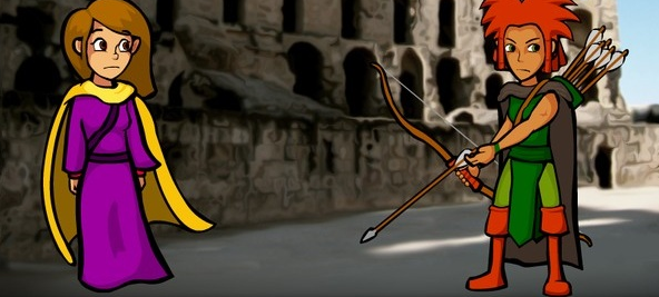
Wow, that’s all the way back from the original pre-release demo version from like… 2011??? And all the photoshop-filtery backgrounds, wow. I’d nearly forgotten. And back when Ketta was red-headed too, before we realized that gave her nearly the same head shape as Slak.
Absolutely fascinating, thanks for sharing!
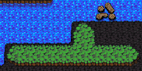
I’m not entirely convinced that your trickery of scaling battle tiles down from 20x20 to 19x19 at 1080p works. When I was just scanning the article, seeing how long it was and looking at the images, I was able to notice immediately that something was off. I’m going to do my own short analysis of a small section of the screen(using this[1] as the base area of the screen to look at)
1:
Due to the way new accounts are limited on the number of links they can make in a comment, I’ve put a Pastebin with the numbers and their corresponding links here: http://pastebin.com/j6JGZyeP
ADMIN: great feedback! I edited your post to put the images inline, and upgraded your permissions to level 2, “member.”
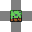
Firstly, the dark tiles and water tiles look mostly fine. I don’t see any glaring issues with the dark tiles, but the water tiles have some obvious scaling issues near the bottom/top of each tile[2] but this is an OK scaling issue for the most part. It sucks, but without proper 2x scaling, it’s mostly fine. Those two tile types are OK. Not shown in the picture, but the sand tiles look fine too, about on par with how the black tiles scaled.
2:
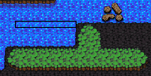
However, there are two glaring issues with the area.
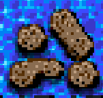
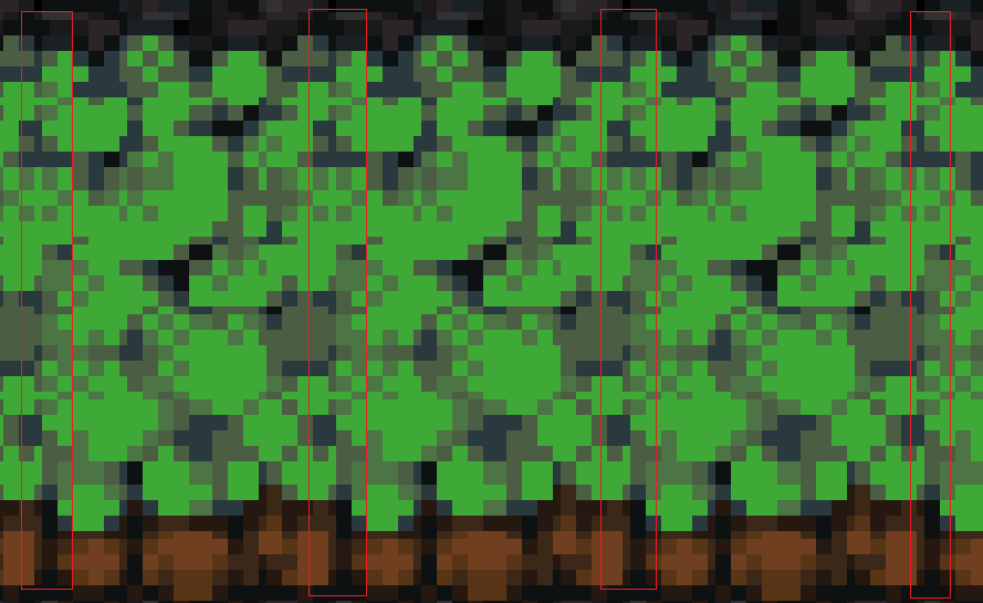
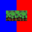
Firstly, the rocks in the water. I’m blowing this way up so you can see the scaling issues without being constricted by the few number of pixels(base image here[3], blown up image here[4]. none of those images are perfectly square but the pixels didn’t get further distorted in the scaling process so it’s fine). The rocks just look so off. The parts that scaled down on this sprite make it look so much worse. For example, here[5], there’s a rock that turns into a long horizontal line due to where the scaling fell. Upon taking a closer look, there’s an obvious grid all over the image, which I’ve drawn (not perfectly straight) lines on here[6]. After noticing it on this tile, I can’t not notice it everywhere.
3:
4:
5:

6:
smile: http://i.imgur.com/1lLOGsm.png
But then the grass tiles are the worst offenders. Not only is there a grid, it’s noticeable due to where it fell. This is what told me the scaling was off when I was scanning the article. This time, I’ve just circled the line where it occurs here[7]. On that whole vertical stretch, there’s an obvious line because the dark green just highlights it against the base green that the grass is colored. To be fair, this visible line did exist slightly in the original art, but with the scaling falling on that exact line, it just highlights it even more and makes it painful to look at.
7:
I don’t really have anything else to say about this. I really love the pixel art of the first game, even if I can’t look at it up close while I play. If the HD remake has the option and finds a different way to scale things up, I’ll definitely use the original art instead, but at this point it’s looking like the higher res art will be the way to go for me, personally.
That’s some excellent feedback! Well, I guess some people can notice it after all, thanks in particular for pointing out the discrepancies.
I guess I have a couple of options:
- Bite the bullet and crop 20 pixels off the top and bottom (would be 25% of the top and bottom map tiles)
- Shrug my shoulders and move on
- Provide some pre-scaled 38x38 tiles that avoid these issues
- Write my own crazy nearest neighbor upscaler that somehow avoids these issues by being very strategic about where it squishes
I might start looking into number 3. I don’t want to get totally bogged down in anything that takes too much manual work, but I might be able to get away with a script that takes the original tiles, does a content-aware scale to crunch them down from 20x20 to 19x19, and then selectively load only these tiles if we’re in 1080p mode.
Either that or any other clever solutions you can think of.
EDIT:
I think I found secret option #5.
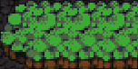
38x38:
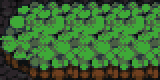
40x40:
Here I’m taking advantage of the fact that 40-38 = 2 pixels, which represents exactly 1/2 of the original pixel. Specifically, I apply the scrunching to the SIDES of the tile:
Okay, so that leaves a skinny 1x1 border on each side. But what happens when you stick that next to a neighboring tile given the same treatment?
1 + 1 = 2!
Problem solved?
Personally, I think option #5 looks perfect! I’ll be interested to see how it looks when the whole screen is scaled that way, but from that small sample it looks great and I don’t see any issues at all with it.
If #5 ends up being too much work to be worth it, #3 would probably work the best out of the other 4, but #5 would definitely be best overall.
Side note: After posting my original comment I realized I didn’t offer any solutions, and THEN realized that I couldn’t come up with any. Sorry about that, but I’m glad you came up with something.
On second thought option #5 might not be a total panacea – it depends on the left/right borders matching up identically, which won’t always be the case. That said I have some other variants of this that could give us acceptable results that are also automatic and simple to apply. Will update soon.
Lars on Polygon with his topic - good AD for DQ 
Polygon, Kotaku, Yahoo! Games, Gamasutra, /r/games, /r/gaming, NeoGAF…
Where did this wave of publicity start, @larsiusprime? What was the first major hit that spread into others? Would be interesting to know where game devs should go if they want a spotlight.
Well it’s a good post about something popular. :V
Heh: Yahoo games just reposted Polygon’s version without even asking me for permission (Polygon got in touch directly). Not that I’m complaining.
I’ve been blogging for years and never had anything go this big, ever. I think this was just fortuitous timing, if I had written the same basic post but not tied directly to Final Fantasy V, and not in the immediate aftermath just as people’s simmering content was boiling over and looking for articulation, it wouldn’t have caught on nearly as big. That’s my theory at least, but there’s no real way to test it.
Whenever I write a post my usual method is to:
- Write it on fortressofdoors
- Post on twitter / facebook / google+
- If it’s important enough put it out over the LUL newsletter
- Day or so later re-post to Gamasutra and make a pitch to the editors for the big feature
- Hope some people will post it on reddit or hackernews
- Wait
It’s hard to boil this down to a formula, because you have no idea what’s going to totally blow up.
I wonder if anyone over at Square-Enix realizes their ports are getting roundly bashed.
Oh, by the way:
You really don’t want to encourage Hero Mode to anyone who hasn’t already beaten the normal game and maybe NG+. In fact, it should be a hidden achievement until you beat the main game, only revealing itself then. I’ve seen at least two people give the game negative reviews because it was unforgivably grindy / difficult for them. A quick question revealed they were playing on Hero Mode for the first playthrough because they thought it was the ‘correct’ way to play, they wanted all the achievements on the first playthrough, or they thought non-Hero Mode would be boring.
It wasn’t until I mentioned it was a super-difficult post-game challenge for hardcore players that they started recruiting generics, found the game more tolerable and flipped their reviews.  Hero Mode is where you go to squeeze a bit more playtime out of the game if you really, truly need one last challenge, not the entrance to DQ. If they’re grinding out levels as their first experience they’re not having fun, I think.
I was gonna say something but realized you said Hero Mode and not New Game+.
Now, back on topic.
Whoa, really? Geez, that’s an excellent point. Okay I’m gonna have to think about how we signal this…
Hi,
I jump in, to react to the UI art style, I don’t know if there is any plan to improve it for the HD version, but it’s pretty messy in the current state, and considering how far you’ve come, it could use some rework I think.
on this screenshot http://www.fortressofdoors.com/content/images/2015/09/dq1080sprite-1.png
I count :
4 different text colors, (white, black, yellow, grey, what an original mix)
6 different backgrounds (including buttons), (2 textured grey, 1 textured brown, 2 grey gradient, 1 gradient blue, yet again, an original mix)
plethora of different text size
It doesn’t feel like there is any art coherency in the UI.
I love your game, (regardless of what I said) keep up the good work.
Aequi
I think the UI is great as it is. The colorful text and buttons make it much less boring and bland. At least it’s all consistent in each of the “sections” (party menu has a style, the waves menu has another, etc.)
It’s been a month and a little bit. Any progress on fixing the upscaling? I’ve been kind of excited to see the results of your struggles.
I’ve been tackling some more mundane aspects of the engine at the moment, but this is on my todo list. Next week I’ll probably get to it, and I should also have some fancified overworld art from our cleanup artist soon, too.