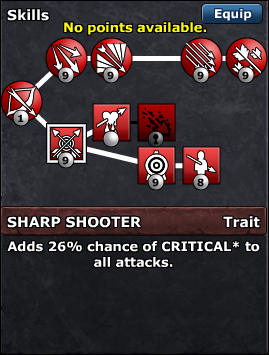
Skill icons for DQ HD?

One of the weakest parts of DQ was the the skill trees, no context was given on any of the skills unless you moused over them.
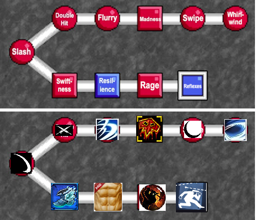
This is just a mockup, but would commissioning visual skill icons representing each skill on the skill tree cost a lot? They could still maintain their round/square shapes, and have a blue/red border around them, but they would look much nicer as icons.

I think they’d be too small.

But if you want to go through with this, I recommend only using 1 color (white).

Oh! I really like the idea of doing skill icons in black and white to make them extremely easy to see. Black Out The Sun could just be a black circle with 10 white arrows over it, Armor Break a black shield with white cracks in it, Devour just a row of white fangs going up and down. A very minimalistic, low cost style. I bet Lars could do most of those himself, or ask the community for help with them easily. :smile:

I think these could be reworked, too, though instead of black and white I think it’d be better to have red and white and blue and white, to keep the information about the nature of the skill (offensive/defensive), like it is now.

1 Like

When I saw “white only” I mean white icon with transparent background (so you can see the red/blue circle/square behind the icon). :V

Those of you who follow me on twitter have probably already seen it, but I’ve been working on this :slight_smile:

I’m going with Alice’s idea (Red+White / Blue+White), so you keep the shape and color information of the skill gem, but just add an icon.

EDIT: as for cost, I found this set of free icons that are royalty free to use, so it only took about a day’s worth of my time all in all, and no money out of pocket:
http://game-icons.net/

2 Likes

That’s exactly how I meant too! :stuck_out_tongue:

Now that I’ve seen them in-game, can the buttons be shrinked? They look soooo big.