Dev Log

For auto-equip:
Name it something else. ‘Auto’ makes it sound like the computer is going to select who gets it. You’re not really automating it, you’re streamlining it. Semantics, but important ones imo. So call it quick-equip or somesuch.

I like your mockup screen. I’ll make one suggestion though. Add two buttons, ‘Place in Inventory’ and ‘Sell’. Then once the player has selected who will equip the new gear if it replaces old gear then bring up the exact same interface for the old gear. So, I just bought an iron sword. I select Slak in the quick equip interface. Immediately the old shank he was using comes up in the same quick equip interface. Because I don’t want that ratty old thing, I just click ‘Sell,’ pocket the scrap, and drop back into the shop menu. Simple, intuitive, and I am now done without even the need to go to the Sell tab in the shop afterward.

For skill tree:
If I understand the thread you’ve already mocked up what I was thinking. Take out the upgrade button entirely, and on mouseover display the current skill info with any relevant changes for skillups as +/- values next to the current amount. It would cause me no end of aggravation not to know what assigning a skill point would do until after it’s assigned nevermind that an undo is free. I want to survey all my options before I select one, generally.

1 Like

Quick thoughts:

  1. Change “Auto-Equip” to “Quick Equip” seems to make sense
  2. Should the quick-equip popup just appear every time, always?
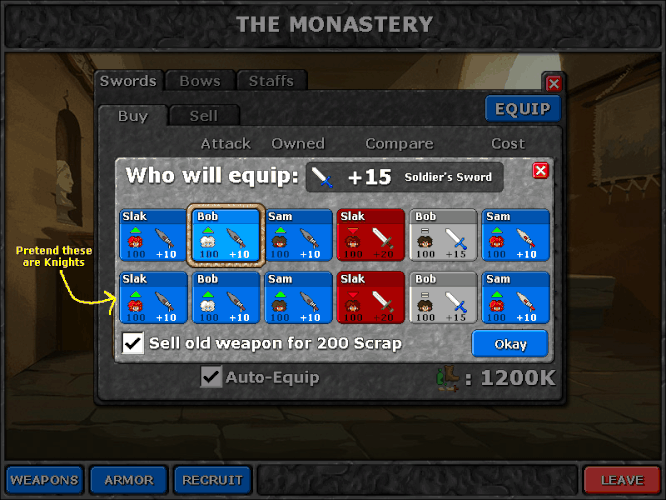
  3. For the quick-equip screen, should there just be a checkbox to auto-sell the old item? I think I had this in the above mockups, but accidentally turned off the layer when I exported the gifs. Here’s what it would look like:

The checkbox would let you equip the new item and sell the old one, all in one go. Also, added some quick mockups for how we might display stats. I like the base + bonus presentation, and to me at least the stat appearing under they guy’s head further cements that that’s the integral attack stat, and the bonus appearing under the weapon the weapon stat. It clutters it up a bit with numbers, but I feel the player would want to know this info all at a glance, and I’ll use color and brightness to indicate importance. Ie, if the old stat is better, it’s dark, and if it’s better it’s white so it stands out. The base stat is less important than the weapon bonus, but it could still affect a purchasing decision, so I’m not sure if I should show it or not. It does add a bit of clutter but it might be important info for this screen.

Re: showing base attack power while buying

Since you cannot affect a character’s base attack power while shopping, it seems like extraneous information that, as you said, helps you clutter up the interface… at first glance.

On the other hand, if you have 6 'serkers and 6 Knights and they’re all different levels and the Knights all have a different number of points in Sword Training, then showing the character’s base attack power is much more helpful - you could give the strongest weapon to the weakest character and keep everyone’s attack power as even as possible with such a feature in place.

From looking at the mock-up, I’m leaning towards keeping the base attack power under the character’s face. It’s not too busy (in my opinion) and with the proper color and emphasis, should prove to be useful information while shopping more often than not.

Cool, I’ll keep that in then :slight_smile:

Almost got the quick-equip interface working. Got the pop-up working and the little buttons coded up and they’re mostly displaying correctly.
Looking pretty good so far. Should have something that matches the mockup either by 5:00 or sometime tomorrow. Will be checking in late tomorrow if at all because I have to drive out of town in the morning, but if I’m lucky I can have this on the test build Friday night.

Okay, looks like Friday :slight_smile: Making good progress tho!

The autosell should only come to play if and when the replaced item is not “green” for any possible character (in other cases I’m not very likely to want to autosell it, so it could only serve to get pissed at own mistakes)

Autoselling would be enabled by a checkmark that by default would be turned off.

Okay, so got back super late on Friday. Test build coming… soon. :stuck_out_tongue:

Don’t you mean… Soon™? :wink:

— Begin quote from "Marak"

Don’t you mean… Soon™? :wink:

— End quote

No, I think he means:

Soon*
[size=4]* If and when he sobers up.[/size]

or in the alternative:

Soon*
[size=4]* Your definition of “soon” may or may not align with that of the developers. Contains “forward-looking statements” which may not directly or exclusively relate to historical facts. These forward-looking statements reflect the developers’ current intentions, plans, expectations, assumptions and beliefs about future events and are subject to risks, uncertainties, homicidial ideation with command hallucinations, and other factors, many of which are outside the control of the developers (especially the stuff involving them going insane in the mainframe). Important factors that could cause actual results to differ materially from the expectations expressed or implied in the forward-looking statements include known and unknown risks. Because actual results could differ materially from the developers’ current intentions, plans, expectations, assumptions and beliefs about the future, you are urged to view all forward-looking statements contained herein with caution, and sit in front of your computer refreshing the beta version download page every 10 seconds. Batteries not included.[/size]

Just had a thought: since you’re puttering with the UI, why not give all the Named Gear colored text instead of those (rather awkward-looking) asterisks?

Compare:

Warrior Monk’s Habit

You could even color-code everything if you really wanted to. Color A for Named Light Armor, Color B for Named Heavy Armor, Color C for Named Swords, Color D for Named Staves, and so forth. Since most of the UI uses grey, stone-textured boxes, there would be no lack of colors to use that would stand out against the color(s) of the windows they are set against.

Monday, March 19th, 2012


Hey all,

So, crazy family emergency happened on Friday, hence the massive lack of planned updates. Basically, all of my estimates are always inaccurate because something crazy always happens. Nothing to worry about - everyone’s fine, etc, but I had a lot less time than I initially expected and instead spent about half my weekend driving all over Texas :slight_smile:

So, I’m putting the finishing touches on the equip menu now and barring any further unexpected delays, should have it out soon. I do have to take off around 2:00 PM (it’s 9:45 AM in Texas right now) to deal with some final stuff relating to the above situation, but then it should be a regular work schedule.

Rather than waiting until this Friday, I’ll try to put the latest build up on the test server at the earliest available opportunity, since it was supposed to go up last Friday. No word on that yet, but “soon” is a good guess :slight_smile:

Also the colored text thing looks like a cool idea. I’ll see if I can give it a try.

Update:

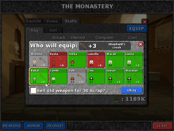
Okay, the new equip interface is up and running. Here’s a live screenshot:

Made a few tiny tweaks. First of all, I made the button background green when the old item is worse than the new, so we have color coordination with both the button background and the arrows. I know this is slightly sub-optimal for people with red-green colorblindness, but we also have both the arrows and numbers as secondary cues so there should still be enough information for those of you who can’t distinguish red/green.

I think this provides all the necessary information, and makes shopping a lot faster. I’m going to try to get this up on the server before 2:00 PM today. We’ll see how it goes :slight_smile:

Update:

Okay, so apparently I have to be at the destination at 2:00, not leave at 2:00. So, I’m leaving in 5 minutes!

I’ll try to get this on the test server later tonight. Thanks for bearing with me.

UPDATE:
New build is up! It’s ready for testing:

Things and stuff to check out:

Some new art!
We’re slowly working in new gold-version art. It’s only ready in a few places, like the title screen.

New Game+ mode works.
If you have a save that has beaten the game on any difficulty setting, this is available.

**New Game+ has like, zero content. **
There’s very little content in yet. You should notice that all the enemies should have a “+” after their names in the preview bar, so they are separate enemy entries, but right now they’re mostly just clones of their normal-mode counterparts. A few of them have some random new-game+ special abilities, but they aren’t consistently applied and might be totally crazy. Also most of them are going to be massively underpowered compared to any level you’ll be at in NewGame+.

There’s one cheapo proof-of-concept sidequest
You can access the sidequest by visiting “shanty” and hitting the “talk” button. This will trigger the quest. The quest battle is just a copy-paste of some other level and the cutscenes are placeholder.

The journal exists but doesn’t do much of anything yet

That’s all for now. Happy testing~! :slight_smile:

Tuesday, March 20, 2012


Really busy today, so I don’t have too much to show you guys, but basically:

-Did a lot of paperwork. Still need to call an accountant tomorrow.
-Talked with our art contractors, worked on art backlogs. Getting a lot of new background art into the game.
-Dickered around a LOT with the content pipeline.
-Working on some new mockups and interface stuff
-Reviewing new character art from our contractors. The new Slak is awesome!!!

Wednesday, March 21, 2012


Today is CPA day! I was lucky enough to get a recommendation on a good CPA local to my area, he lives not too far from my house.

So far I’ve been doing all our accounting in GNUCash, but I have no idea if I’m doing it right and what legal things I’m missing out on. So, after my initial consultation with our new accountant Ed, I’m sending him an initial report of all our stuff so he can tell me all the horrible things I’m doing wrong and how I can crawl out from underneath it and avoid an IRS audit :slight_smile: Or he’ll tell me everything’s fine. We’ll see!

This means I have to scan a billion documents. I hate scanning documents.

Okay, got all the stuff sent to the accountant. Now we’ll see what he says and what the next step is.
Look Ma! I’m a real business person with an accountant and stuff!

Just sent a contract to our new tile pixel artist. He’s pretty awesome and should compliment our character artist and Karen pretty nicely :slight_smile:

Okay, next thing I’m doing is giving some attention to that skills upgrade menu. Let’s see what I can do there :slight_smile:

So, [size=14]FEEDBACK TIME![/size] can anyone tell me if there’s anything wrong with this approach over the old one?

Oh, and just so I’m clear - this dev log thread is mostly for me to post in, but I don’t mind if one of you weighs in with an insightful comment every once in a while. I don’t want it to get so noisy that my dev posts get lost, but if you’ve got something useful to say I’d love to hear it. We’ll see how that goes, and if it gets too crazy we can start a separate thread for responses to the dev log, but I think we’re still a small enough community I don’t need to get any crazy protocols set up just yet.

Well since you say it’s ok, here I go. The new approach is just fine, as long as it’s clear and has a certain basic level of aesthetic appearance. There are not any new contrary colors neither any unecessairy details[text/graphics]. My opinion is that you shouldn’t worry about small stuff like these yet, finish it first so we can test it and tell if something looks wrong; I’m mostly anxious about the breakthrough in gameplay; will ng+ mode actually have to offer more entertainment or it will just be a boring contuinity of the original storyline?

Okay, so making great progress on the skill menu. I’ve got it mostly working and I like the new version a lot better - much faster to allocate points, easier to tell at a glance what everything does, and best of all - this will be much easier to localize as it doesn’t depend on a big chunky algorithm designed to splice together English sentences.

Just a few more tweaks and then it’s done.

Oh, I also wrote a new blog post - “http://www.fortressofdoors.com/2012/03/pay-what-you-want-and-four-currencies.html

Friday, March 23, 2012

SO!

Just finished the skills menu fix. It took a little while because I was also polishing off an article and a secret feature I’ll be announcing at a later date.
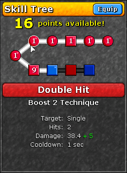
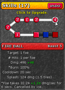
Here’s a screenie or two:

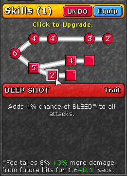
Dragon’s skill tree / Ranger’s skill tree

There’s no longer an “upgrade” button. Instead, you mouse over a skill to inspect it, and you click once to assign a point. When you mouse over it will show you the current stats, and show what the next upgrade will do in green text like it does in the boost menu in battle.

It might seem like a tiny thing, but I feel like an enormous amount of the meta-game’s decisions are “which skill do I get?” and having as accurate information as possible that’s easy to digest and compare to other choices is key. Not only that, but the complicated sentence structure text was hard to maintain, and would have been a real pain in the butt to localize/translate to anything other than English. Just imagine having to write a version of that function for German. shudder

Okay, so on to other stuff now. Let’s see what I can get done today.

Oh, and also, got some nice press mentions! Rock Paper Shotgun has graced us with a http://www.rockpapershotgun.com/2012/03/22/second-wave-defenders-quest-free-gold-update/ about our gold edition! There’s been a commensurate spike in sales, and JayIsGames picked up the story for a http://jayisgames.com/archives/2012/03/link_dump_friday_259.php.

Okay, I’m putting in all the boilerplate for sidequests. That means creating level files, creating triggers, hooking up all that good stuff. We originally set up the game progression trigger to allow parallel “quest” lines besides the main linear plot progression but never used it - now I’m glad we had the functionality as it makes it easier to set up :slight_smile:

Once this is done, Anthony and James can fill in the quests with content while I move on to programming other things.

Also, I have to go to the post office today. Been putting that off.

1 Like

Monday, March 26, 2012


Okey dokey, let’s talk about what we’ve got done today.

Sidequests
All the basic sidequest technical stuff is done. The sidequests are placed on the map, and you can trigger cutscenes in towns that will, in turn, make them visible & connect up to the rest of the map network.

They show up as purple map pearls for now, and they’ve got intro/outro cutscenes for James to fill in later, and battle and reward content for Anthony to tinker with.

We’ve got seven of them, and I think that will be plenty. Rather than have one at each town, their placement has been guided by natural points in the story where we could identify natural branching off points. I won’t list where they occur quite yet as it might spoil things :slight_smile:

Had to fix a bug where sidequests in the underground fortress weren’t interacting correctly with the fortress’ roof - it would show up whenever you went to a sidequest and then it’d be hard to move around again. Fixed that just now :slight_smile:

Our pixel artist, http://www.pixeljoint.com/p/20426.htm has been working hard on new character sprites. As soon as he uploads his latest stuff for today I will show them off here :slight_smile:

We’ve got a new tile artist, too, but he’s on the other side of the earth so he’s always asleep when I’m working and vice versa, so it might be a bit before I can show his work on the dev log :slight_smile:

Also finally got most of my paperwork done. Finally!

Moved everyone’s posts on my 4 currencies article to the relevant off-topic thread :slight_smile:

Working on upgradeable equipment. Just got all the spots on the map for it, now I need to work on an equipment upgrade UI and the underlying mechanics. Should get that done tomorrow, probably.

Plan for the rest of the week:
-Special sidequest logic (super secret!)
-Weapon/armor upgrade “towns” + interface
-Special secret places that do secret stuff

For the Skill Trees, would it be possible to make “Left-Click” be +1, and “Right-Click” be -1?

For example, if Ketta has 5 points I can allocate to any skill, and I want to see how Deep Shot +5 would work, then decide against it and only want to make it +3, I just right-click that twice and left-click Piercing Shot twice. That would make it Deep Shot +3 and Piercing Shot +2 without having to press Undo so much (if I wanted to change a lot pretty quick).

If you need help seeing all the stuff we upgraded, maybe add a little dim highlight around the Skill Pearls that were upgraded? That way we can see at a glance what we’re doing with our characters before finally accepting the changes.

I have a slight short-term memory when it comes to this sort of stuff, so that would help a lot. :

@Ceielo:

I like that idea! It’ll only work for the download version, since vanilla flash doesn’t support right-clicks, so won’t work in the Kong version.

Thursday, March 29, 2012


Sorry for no update today until now, but here’s what’s new. Lots of exciting stuff! Pics tomorrow
[size=14]Upgrade unique equipment system = THEORETICALLY DONE.[/size]

So, the way it works is there’s a new item you can collect from battles as a reward, skulls. These can be of various types (gold, silver, etc). Right now I just have placeholders. These items can’t be equipped, but they’re used as currency in special town stores that can upgrade your unique equipment.

James is still working on the story theming to explain them, but technically wise, they’re little places on the map you can go and upgrade your stuff.

The store works like normal, but it will only list unique items you have, and show you what they can be upgraded to. It costs a certain type and number of skulls for each unique item to be upgraded to its super version.

The super version will have a high base value, and most will have a base stat multiplier so they grow in effectiveness as your character levels. Then, some of them will have different special abilities. Here’s the toolset I’m using for specials:

  1. ADD an attack flavor to all attacks (will have to be used carefully so as not to unbalance things)
  2. AUGMENT an existing attack flavor (such as, make bleed more powerful, more likely, etc)
  3. Give a bonus to some stat (speed, evade, etc)

For armor:
4) PORCUPINE (dmg_multiplier) + flavor : this causes an enemy that melee-attacks you to take (dmg_multiplier x attack) damage, along with some flavor. So, you can make yourself poisonous when hit, or something.
5) STRONG vs (damage flavor) - this will let you either RESIST (reduce damage by multiplier) or EVADE with a ceratin% an attack of a certain flavor, such as “physical”, or “magic”, etc. You can also use to SAVE vs a certain attack flavor - ie, if an attack has this flavor, and you are above X% HP, you are reduced to 1 HP instead of being killed. So, “save vs magic 5%” means, a magic attack cannot one-shot you, unless you’re below 5%.

And finally:
6) VS(enemy_type) --> (Any of the above)

So with that last one, you can make it so the special ability only triggers vs. a specific enemy type. This way you can have “Wurmslayer” that does double damage to worms, or “Cloak of Cultist Repellant” that only porcupines vs cultists, etc.

This is just the tech stuff. It’s up to Anthony to make some useful equipment choices from this stuff that actually works and isn’t insanely unbalanced :stuck_out_tongue:

This WILL be on the test server tomorrow. I will make sure of that if that’s the only thing that gets done tomorrow.

1 Like

Friday, March 30, 2012


Okay, so it might be kind of rushed, but I will get SOMETHING, no matter how broken, on to the test server in the next 15 minutes. Got a lot done this week. Let’s talk about what that is.

[size=14]**1) Upgrade system = READY TO TEST. **[/size]

Although these features are present, this will be difficult to test, so I’ll try to upload a test save that might be useful. At any rate:
-Start a NewGame+ (requires an end-game level save - MAKE BACKUPS if you’re using the test build! OMG USE BACKUPS it is so unstable)
-Beat Act I, get to Karsk
-After Karsk, you’ll unlock a new town simply labeled “sword hermit”
-Go to this town, and if you have a) unique swords and b) skulls, you’ll be able to upgrade stuff

For now, the only way to get skulls is savegame hacking. Create inventory entries of class “armor” and type “skull” with any level between 1 through 5, and that should do the trick. Skulls cannot be equipped.

I’ll try to get a save file with all that stuff up on the test server by 5, but no promises!

[size=14]2) New Character art[/size]
I’m testing out new art from our sprite guy. However, I didn’t have enough time today to fully test it, so I absolutely guarantee that it will probably look weird and have problems. Don’t use this as a judge of what it will look like in the final version - I need to fix animations, timing especially.

Also, I rejiggered the palette for the berserkers so I’m absolutely sure that your existing berserkers will look like they have a skin disease when you load an old save in this version - a quick trip to the redesign button should fix that.

I’m not sure if you guys have seen karen’s new background art yet - some of that is in, though a lot is still missing. She’s about 50-75% done, and I only have about 25% of her total work in the game so far.

James put some retouches on Slak’s cutscene art, that’s in.

Here’s hoping I get it all packaged and uploaded by 5 o’clock!

As I’m in a rush, this test build will be windows-only for the moment. Sorry mac/linux guys :frowning:

ARRRRRRRRRRRRRRRRRGH NO TIIIIIIIIIIIIIIIIIIIIIIIME

Oh well. Updating now. Super semi-broken but kinda playable build it is!

Uploading now. Already updated page with the link. If the download’s incomplete, wait 10 minutes for it to finish uploading.