Wednesday, May 9, 2012
Okay, so things are progressing pretty nicely, though I’ve been too busy to post enough development updates and let everybody know about them 
Art update! Before I said we were at this:
— Begin quote from ____
Background Art: 80% done
Character art: 40% done
Tile art: 35% done
— End quote
Now it’s more like this:
Background Art: 98% done
Character art: 60% done
Tile art: 50% done
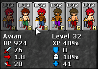
James and Anthony are finishing up the writing / design for our sidequests, and Karen has just about finished all the background art so I’m nearly done integrating that. Tyvon has finished the new sprites for Berserkers, Rangers, and Healers, and is nearly finished with Knights. The first three are already in the game, I will try to get a test build up today if I can.
Click on the berserker for a link to a mostly-up-to-date sprite-dump
http://files.fortressofdoors.com/images/chars/imgs.html
When Tyvon finishes all the sprites, I’ll give him a crack at designing a new skin for the UI to help tie everything together.
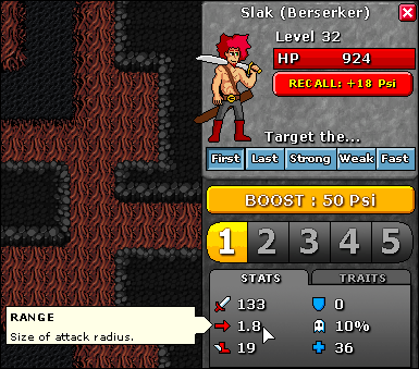
I’ve done some minor redesigns to the UI, as I felt it was really wordy, which makes it intimidating for new users and hard for experienced users to see the most relevant information at a glance. To that end, I’ve started replacing stat names like “Attack” and “ATK” with little symbols.
Symbols are not perfect, and can be ambiguous, but I feel I can overcome that by pairing them with a tooltip. Honestly, a three-letter acronym is about as difficult to understand as a symbol, and a symbol takes up less space and looks less awkward. It also gives me more room for digits so there’s less risk of running over.

This way, once you know what the symbols mean, you can just glance there to get at the info, without the name of the stat competing with the number for your attention and generally cluttering up the interface. New users who are confused can mouse over it and see the name of the stat and a description of what it does.
I made the offensive stats red and the defensive stats blue. I used a sword for “attack” and a shield for “defense.” Those are obvious choices. For speed, I used a winged boot, and for regen I used a blue cross. For range and evade I didn’t have any great precedent, at least not that would fit in 16x16 pixels. I wound up using an arrow for range, which isn’t perfect because it could also imply “speed,” and for evade I was truly stumped - the best I could do is a little ghost. This is my weakest symbol for sure but I couldn’t think of anything else that I could actually draw in 16 pixels.
I’ve also cleaned up the defender interface a bit. I figure you don’t really need to know how much XP a defender has in the heat of battle, and I was already showing that in two places - in the summon menu, and on the defender select panel. I figured if you absolutely need to know that info, you can go to the summon panel and mouseover the stat. Otherwise it’s just clutter.

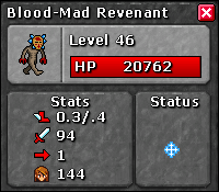
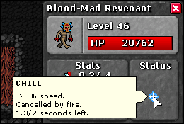
I’ve added a status effect panel for enemies, can’t remember if I mentioned that before. Each icon has a tooltip that lets you know what the stats are, and updates in real time.


This gives me room for a little panel where I can put active status effects, like we have for the enemies. Haven’t implemented that just yet.
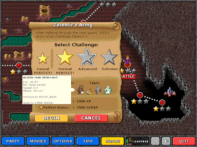
Also, I added mouseovers for Enemy previews, so you can get relevant information before a battle:
I’ve been working on the cutscenes as well, integrating all this awesome new background art, and lots of other things. I’ll post more info soon, and I’ll let you know when the new test build is up.

 . We don’t need all fancy bells and whistles release candidate, just something to play with to test supposedly fixed bugs. And a list of those fixes. (I can see nothing changed in bugzilla, so I assume that these were not reported there.
